A watch is not merely a functional tool that tells the time. It is also a stylistic effect, a concentrated blend of technical sophistication, a means of standing out from the crowd. Sometimes these aspects of its nature are conflicting and even end up cancelling each other out, rendering the watch simply illegible. All it takes is a particular set of colours, a proliferation of markings, an under-estimated font size… and the dial information suddenly becomes impossible to decipher.
The first pitfall is colour and one in particular: namely black. Paratrooper style has had its brief heyday that revealed its limits. Black dial, black case, black hands and black typography: even when squinting carefully at the dial in full sunlight, one cannot be completely sure what the time is. The surprising thing is that this result is a by-product of the sports watch, which generally strives for excellent readability, the most notable example being the diver’s watch. Pushed to the very extreme of the ‘concept for concept’s sake’ approach, tone on tone has led a number of niche brands to offer watches with opaque ‘blackout’ sapphire crystals.
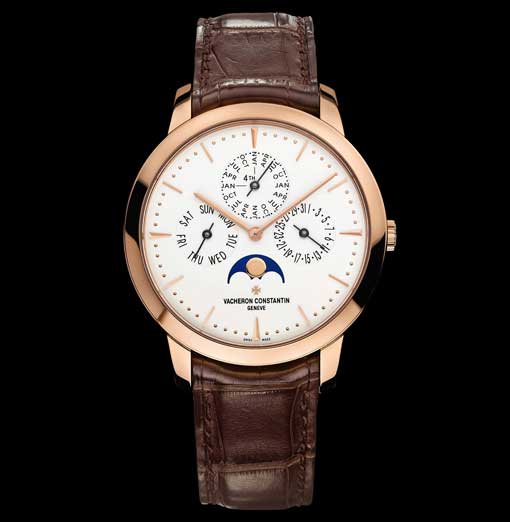
The second pitfall is the scale ratio between the watch and its movement. Cases and dials have grown over the past 15 years and it is easy to adapt them to current tastes. Meanwhile, however, new movements are not developed at a similarly fast pace. Continuing to use size M calibres in XL watches has led to a number of disproportionately sized innovations occupying watch dials. The results typically involve squashing perpetual calendar subdials near the centre and squeezing 48 consecutive months onto a 0.8 cm-diameter circle.
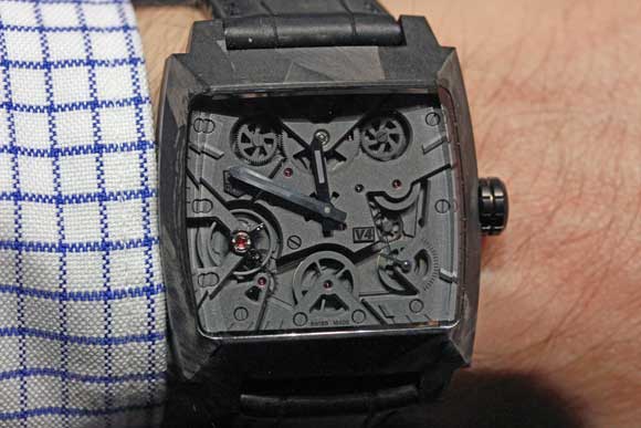
The third risk is overcrowding. Complicated watches are the subject of a certain overkill which tends to pack information onto dials. As a result, they become far too ‘busy’ and nobody really knows what is going on. The phenomenon reaches its peak when it comes to complicated skeleton watches. Between cut-out hands and a sapphire crystal dial affording a perfect view of intricately entwined components that are also skeletonised… the result can be a bewildering tangle!
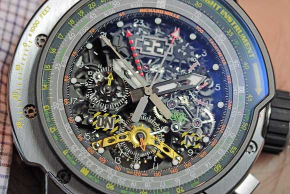
These legibility issues may be deliberate: in such cases, the brand takes full responsibility for its choices and customers accept them accordingly. They may however also stem from a design flaw. Watches are developed on high-definition computer screens measuring 24 inches and more and magnified to 800%. But a dial usually measures little more than 35 mm in diameter and one should never forget this.
The real risk with regard to these questions of readability is that substantial numbers of high-end watch buyers find themselves side-lined. Eyesight deteriorates after the age of 50, and yet this is precisely the time when this newly longsighted population achieves its highest standard of living. Peaking careers, empty nests and a desire for selfish indulgence often lead to the purchase of expensive watches. What Americans term a mid-life crisis often coincides with a need for half-moon glasses to read the newspaper… and one’s watch. Forgetting that fact can lead to the risk of a commercial flop.
