Black is associated with virility, power, mystery; and blue with the night, infinity, space, the ocean and even royalty. Grey? That would be…. That would be what exactly? Now here’s a colour of which the attributes are not yet clearly defined, yet which is attracting an increasing number of brands. Above and beyond silver or white gold dials that are naturally grey, a large number of models are appearing with “applied” shades of grey. Sober and elegant, it has the advantage of treating existing dials to a brand-new look. Grey also has the ability to blend into chic, sporty or everyday environments. Could this be watchmaking’s latest chromatic ‘nugget’?
Institutional manufacturers in the forefront
Several brands are hooked. Starting with Chaumet, which has just revealed a steel Dandy chronograph with intense grey hues, alternating between a polished surface and satin-finished sides. This sober piece thus plays on the multiple reflections which grey can provide in order to produce a sport-chic look.
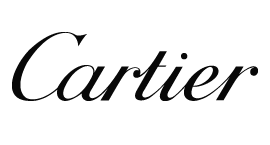
Cartier’s ultra-thin Ballon Bleu de Cartier comes with a new anthracite guilloché face. Here, the Manufacture plays on the contrast between the depth of the grey and the glow of the gold. Its finely chased dial allows it to capture the light in a number of ways, resulting in endless variations in tone depending on the light.
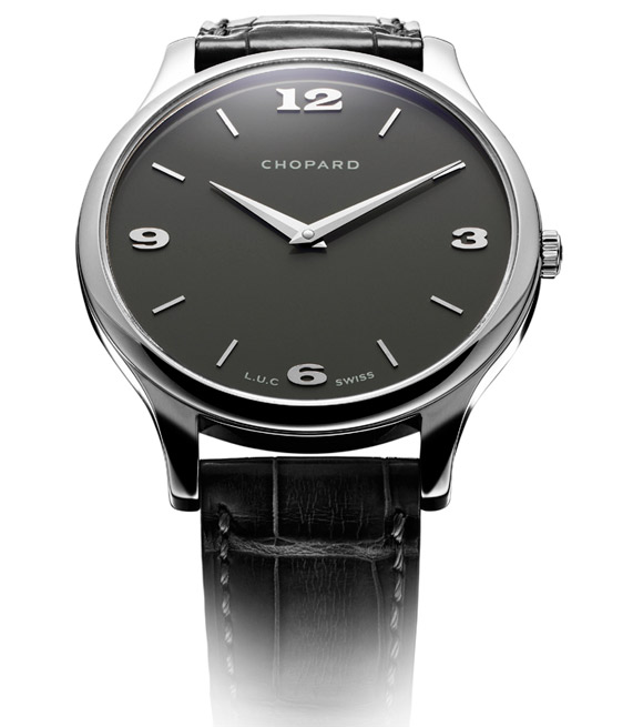
Chopard, on the other hand, opts for a slate-grey shade with the L.U.C.XP. Available in rose or white gold variations, this timepiece, winner of the 2006 Geneva Watchmaking Grand Prix in the ultra-thin watch category has become a classic of Chopard’s L.U.C. collection. The new slate colour of the dial equipped with four Arabic numerals and applied hour-markers enhances the sobriety of the creation and emphasises its elegance even further.
Talking about slate, Harry Winston has applied the principle almost literally with the new Midnight Monochrome Automatic that appeared in stores a few months ago. Like all the brand’s “Monochrome” versions, it explores the nuances of a single shade applied to the dial. The slate effect chosen here gives the model a distinctly a mineral appearance, far from the perfection of smooth dials and even featuring a large number of eye-catching rough patches.
The two-tone approach of a grey dial and gold hour-markers also appears to have captivated Vacheron Constantin, as illustrated in its recent 20-piece limited series created for Parisian retailer Dubail’s 20th anniversary.
Subtle shades of grey for a casual chic atittude
A few weeks ago at the SIHH, Audemars Piguet presented its brand new Royal Oak Offshore Chronograph, a piece featuring a slate-grey dial with a “Méga Tapisserie” motif, which endows the watch with multiple faces according to how it catches the light.
Still on the sporting side of Fine Watchmaking, the Blancpain Fifty Fathoms Bathyscaphe comes in a dark grey like the seas for which it was intended.
Finally, Ball Watch regularly uses this colour which appears on two of its current models: the Trainmaster Roman and Cannonball. The combination is quite unique, since it marries this modern grey with a design drawing on the brand’s aesthetic fundamentals from the 1930s. A daring move that proves a perfect success!
Light grey or dark grey: why choose?
DeWitt has gone in a different direction with each shade of grey getting its own dial, as illustrated in the two variations of the T8 Tourbillon, each showcasing one of the shades to maximum effect.
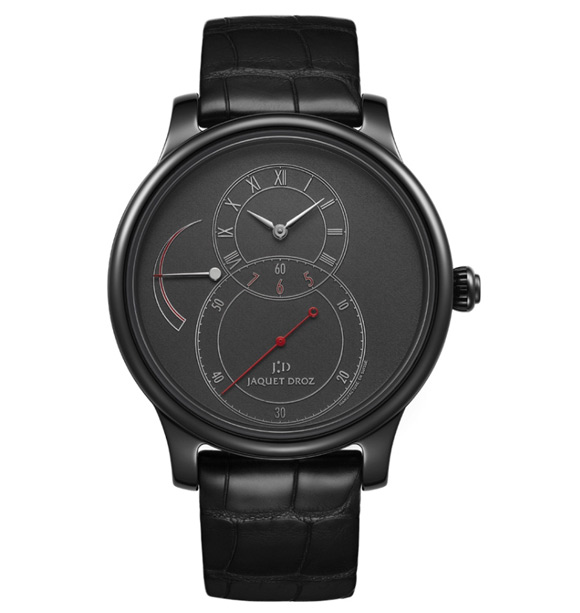
At Jaquet Droz, the chromatic nuances of grey are used in accordance with the technical nature of the watch. On the mineral front, ceramic goes grey to magnify the dials of the Grande Seconde Réserve de Marche by Jaquet Droz, while a slate-grey dial also graces the Chrono Monopoussoir Cercle Ardoise..
In the realm of the new watchmaking generation, Christoph Claret is a long-time fan of grey dials. He successively unveiled these shades in the Kantharos launched in 2013 and the Poker in 2014. Slowly but surely, the master watchmaker is tending to assert a powerful aesthetic signature consisting precisely of these grey dials swept over by red hands.
The forerunners
At Zentih, grey is part of the brand’s heritage. It is also one of the primary colours used by EL Primero since 1969. The brand with the guiding star remains true to this colour, notably with its re-edition of the 410 version of the famous calibre, which was launched a few weeks ago. It had been preceded by the Elite Ultra Thin in similar hues and remains a grey reference for Zenith.
In addition, speaking of “chronograph legends born in 1969 “, it is entertaining to note that TAG Heuer’s famous Monaco has also been re-interpreted in a “Vintage” variation, entirely clothed in grey and launched in 2010.
That same year, Glashütte Original unveiled the PanoMaticLunar XL, with a superb uniformly deep grey matt dial. Girard-Perregaux also offer a similar moonphase with a grey dial on the most recent Vintage 1945 XXL Large Date and Moon Phases model.
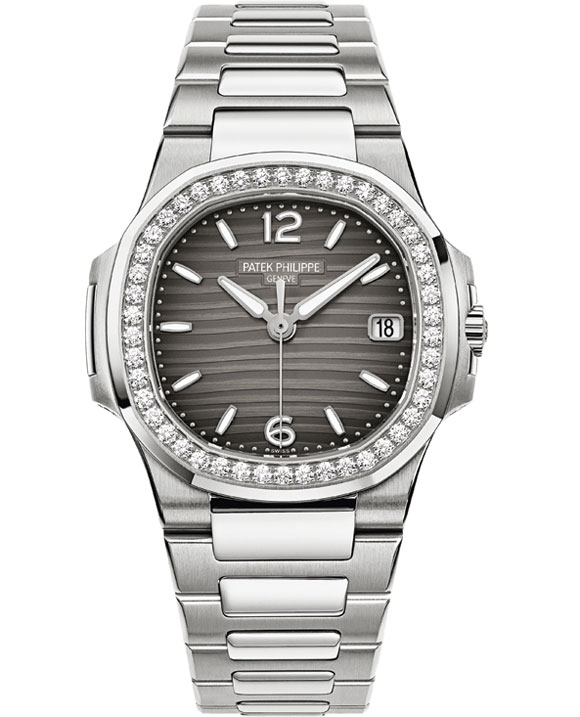
For women, grey is coming into play more progressively. In 2013 Patek Philippe launched the Ladies Nautilus models with new smoky grey dials adorned with a relief motif forming small waves and specially created for the ladies’ model.