We are used to hearing that 80% of the message in communication is not expressed in concrete terms: gestures, tone of voice and posture convey the majority of the information. The same is true of the written word: the font (or “typography”) sets the tone of a message.
In the world of luxury watchmaking the watch dial acts as a stage for numbers that draw us into the brand’s universe and the concept behind the product. Whether they are Roman or Arabic, transfers or appliques, they are not simply material but they are shapes, too. Since they are always a balance between technology and poetry, watch brands make specific typographical choices, which I aim to illustrate here with some examples.
Two strategies
For some brands, the typography on the dial is a genuine signature, while for others it can change considerably depending on the model.
For Richard Mille and Officine Panerai, the typography is an integral element in the brand’s identity.
Conversely, at Breitling and Hermès, typography can vary according to the model.
Visual proof
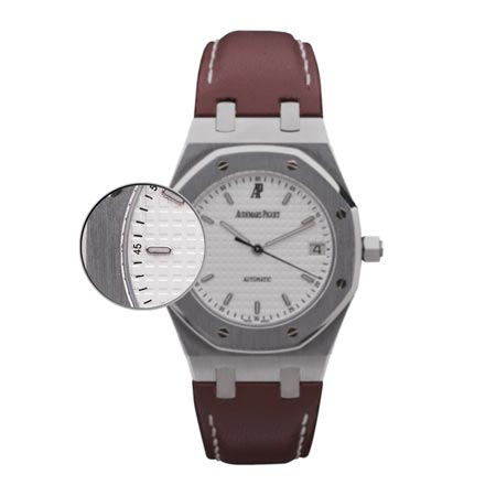
Audemars Piguet
The sans serif font maximises the legibility of the small size, the numbers are narrow, close together and closed. On the majority of models the numbers are discreet, meticulously aligned as an extension of the hour markers so that they don’t disturb the graphic balance of the brand between the hour markers and the screws.
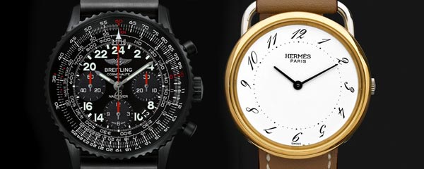
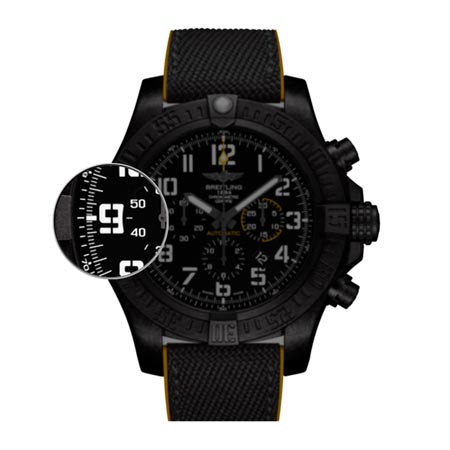
 Breitling
Because of their profusion and their shape, which is a rectangle with rounded edges, Breitling’s numerals recall an aeroplane cockpit. Several models also use large stencil-type numerals, the gutters of which allow the characters to be cut out to make stencils. This type of stencilling is used by the armed forces and Breitling uses this technique to convey a sense of reliability and robustness.
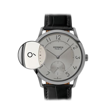
Hermès
Audacity predominates at Hermès. There are no limits on the choice of typography at the brand, since it is a fashion statement that adds a touch of singularity to each model. As proof, take the Slim model, whose numerals were designed by Philippe Apeloig and incorporate “lines that are sometimes interrupted, silent spaces in the design, which mark the cadence of time.”
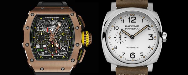
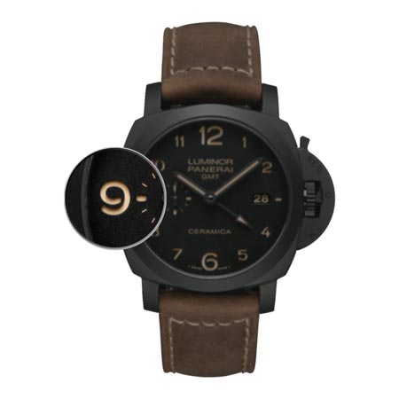
 Officine Panerai
Panerai’s numerals are giant, like a submarine and the ocean depths it travels, which shows off their rounded nature. Everything about their shape is extended, from their round extremities (the base of the number 1, for example) to the slight diagonal curve in the number 2: you can instantly hear the distorted sound of the great depths. Interestingly, the stencil style mentioned above for Breitling is used differently here, since the 6 and 9 are opened rather than cut off.
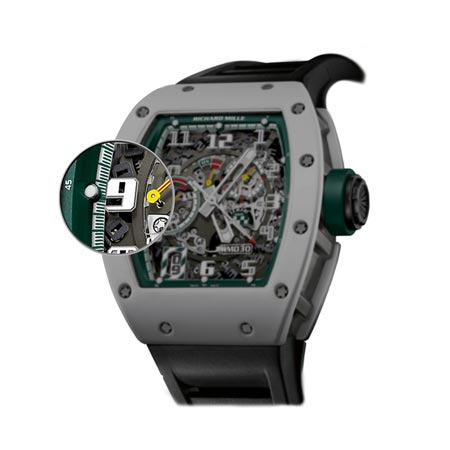
Richard Mille
The numerals on Richard Mille watches are totally angular: there is not a curve in sight. The extremities even have extremely acute angles, which fit with the cutting-edge philosophy of the brand. The contrast between the thick and thin strokes is also pushed to the extreme: at RM, it’s all about the balance between impact and finesse, the tension of performance is palpable. Note the brand’s preference for “outline” numerals, which fit with its exploration of the links between the interior and exterior of the watch.
 Since the invention of the printing press around 1450, typography has accompanied the evolution of our society. Through our common cultural references it can evoke strong values that underscore the positioning of a watch brand.
Noémie Oulevay is co-founder of the graphic design agency Contreforme.