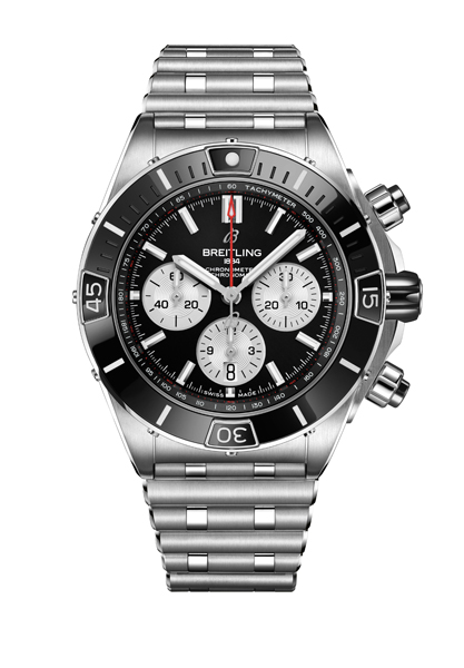
Breitling recently launched the turbo-charged version of their iconic Chronomat watch, the Super Chronomat, filled with features that will appeal to those who remember the ubiquitous 1980s must-have sports watch with fondness. Apart from distinctive stylistic touches such as the new Rouleaux-inspired strap, the GMT module, and the prominent rider tabs on the bezel, the Super Chronomat also comes beefed up with refined movements such as one model with a four-year calendar (requiring adjustment only once, during leap years). Upon its launch, creative director Sylvain Berneron shared some insights as to the strategy behind this launch and his overall vision for the brand’s identity.
WorldTempus: We’ve just seen the launch of the new Super Chronomat, which, together with last month’s Premier timepieces, strongly appeal to collectors and lovers of vintage Breitling. Last year, on the other hand, was a bit more focused on developing the contemporary identity of the brand. Can you tell us a bit more about what this means for the overall creative vision of Breitling?
Sylvain Berneron: Our real goal is to bring Breitling back to its former full glory. And that's already a very delicate mission, because Breitling has been on its A-game at various stages of its history. It started with the chapter of the Breitling family, after which we had the Schneider era — both these families were able to grow the brand within different segments of the market. What we’re trying to do now is actually to combine these two sides of the brand and to elevate Breitling to a level that it has never been before.
On one hand, we’re pushing the creations from the Schneider era into the future. In other words, the Chronomat, the Aerospace, the Emergency, what we used to call the instruments for professionals. On the other hand, we’re also bringing back the original DNA of Breitling designs from the 40s, 50s and 60s, the pieces that we can see are very much appreciated by collectors, such as our good friend (collector and vintage Breitling expert) Fred Mandelbaum. These guys had a long winter, during the Schneider era, but they still had a great love for Breitling.
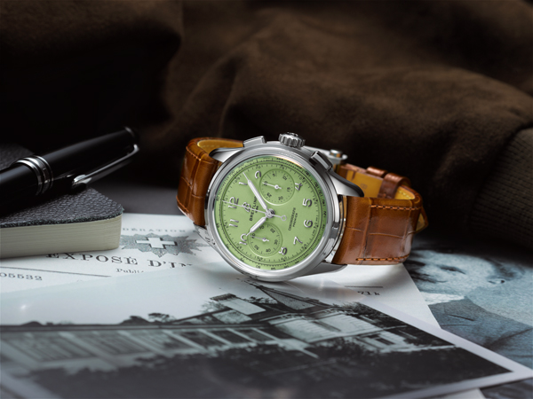
So let’s take the Premier Heritage launch, for example. We went back to the brand archives, and I was talking with Fred day and night, analysing what were the key points we needed to integrate for this project. And this step was crucial, because Breitling is one of those brands that has been very productive in terms of creativity — they tried so many styles and sizes and complications. The history with this brand is so deep that even after three years I’m still getting familiar with Breitling heritage. That’s why we surround ourselves with experts who can guide us through this incredible back catalogue and make sure we hit the right spots in terms of creative design.
Coming back to your original question, these are the two major areas we’re working on. The Premier Heritage launch was, as you said, referring back to the 1940s era of Breitling. The Super Chronomat is part of our efforts to bring the more modern pieces into the 21st century — it is strongly identified with the 1980s even though it was a pre-Schneider era collection. The 1980s is when the Chronomat really became an icon.
WT: That’s a fascinating insight into what goes on behind the scenes for the creative vision of Breitling. As you say, those two eras of Breitling were so different, even though they are both equally essential for the brand. Breitling lovers are attached to the different eras of the brand for completely different reasons. As creative director, do you think it’s possible to combine the appeal of these two eras a bit, to bring about more of a unified community appreciation for Breitling? Or perhaps it makes more sense to keep them apart and have these distinct sub-identities within the brand?
SB: It is an extremely complex exercise, because we have two types of clients. We have for example on one end of the spectrum, someone like Fred, who has a deep knowledge of watchmaking and who knows the archives by heart. Guys like Fred love traditional watchmaking, they love complications, they look for things like purity and balance on the dial, the proportions of the watch cases — even half a millimetre is a big deal in their view. On the other end you have the more modern, outdoor-lifestyle clients; they love the titanium pieces, high water resistance, bigger case sizes, high-performance watches. As the creative team, our goal is to understand, respect and emphasise the legacy of the brand. It’s not for us to erase one side or another of a brand, in anything that we do. All of it comes from the full range of what Breitling is able to do. It’s probably the brand with the most diverse offer in the industry — with 1940s-inspired complicated watches in gold with in-house movements, and also titanium quartz watches such as the Emergency. That can make it very hard to speak equally to all our customers with one watch, because of this range.
WT: My next question to that, is of course, do you see any overlap between the different audiences of Breitling? I mean, in principle, it is possible to like traditionalist, classic watches and robust, sporty watches at the same time. Clearly this is the case for you and me — we’re able to appreciate both.
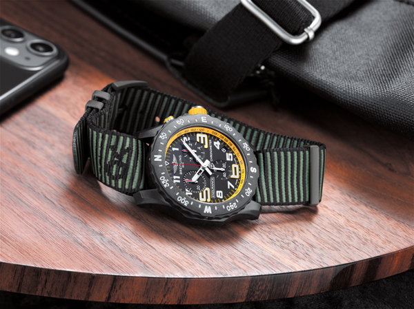
SB: Definitely people like you and me, who are in the industry, we learn to appreciate the whole spectrum. But usually when people enter the world of watches, they do so from one end of the spectrum. Either they need an instrument to start with — so they would probably buy an Aerospace or an Endurance that can accompany them while they swim, or cycle or run, and that’s how they come to Breitling. After that, they can always make their way through the brand portfolio and learn to understand and appreciate the more traditional watchmaking side of things.
Or they can actually do the opposite — start with a watch that’s very elegant or more for business or daily wear, before discovering the other end of the brand with its technical pieces.
The tone of the brand can be very casual while still being technical, which gives us a lot of versatility without compromising on quality. When I first came to Breitling, I was deeply impressed by the amount of homologation testing they we do on the pieces here. The quality testing is almost triple of some other companies.
WT: I think that's something that people very much appreciate about Breitling watches, though, that there is a certain level of performance that they can expect. This high performance is reflected throughout the watch, in every aspect of its mechanical construction and even its design.
SB: The Super Chronomat is interesting to examine here, because it's actually the Chronomat DNA stretched to its highest extent. Last year, when we relaunched the Chronomat, it was all about finding the starting point, the essence of the Chronomat. I would say that it comes down to three main features, in terms of design: the Rouleaux bracelet, the rider tabs and the ogive crown, which was originally designed to look like the nose of an airplane.
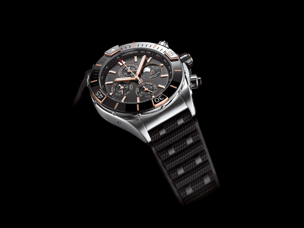
When I spoke with people who had been with the company a long time and they knew I was working on the Chronomat, they told me about how successful these pieces were 20 years ago, and how their flamboyance — the strap modules, the bright colours, the design details — were very much a part of that success. We extracted that aspect of the Chronomat and brought it into the 21st century, which is why we day the Super Chronomat is the supercharged version of the regular Chronomat. It’s a very capable watch, we used ceramic, we integrated screw-down pushers, brought more complex movements — but also it looks very formal. It exists both in the formal and the technical domains, so it’s really at the crossroads of our brand portfolio.
WT: That brings me to our last question, because I notice we’re running out of time… I want to say that despite the 44mm diameter of the Super Chronomat, which could be considered quite large compared to the average watch launch now, that it seems to be a watch that works equally well on masculine or feminine wrists. It’s really all about the style, and the personality that’s required to pull off a large piece like this. Are there plans to speak to a female audience with this watch? Because the current visuals surrounding this watch are very masculine-oriented, and yet we see during the Breitling Squad Talks, for example, that there is a small but growing community of women who love Breitling and its particular design aesthetic. They don’t necessarily want smaller watches; they appreciate the brand as it is.
SB: Yes, yes and yes, totally. We see this more and more. One thing to remember is that Breitling is a brand that has always been on the larger side of things, even historically speaking. When you make technical, high-performance watches, you need space and volume in order to have good readability. That’s also where this association with the colours black and yellow comes from, because it’s the most readable ratio in terms of colour imagery.
We still have a long way to go with women, since you know that our main audience has traditionally been men. But when we design now, we no longer design with men or women in mind. Instead we offer different sizes and work on things like ergonomics and fit. Personally, I would choose the 36mm Chronomat for myself, and I see some of my male colleagues come into the office wearing pieces that are between 34 and 36mm in case diameter. It goes to both ends of the spectrum for men and women. In terms of our visual communication, you will see — we’re getting there.