
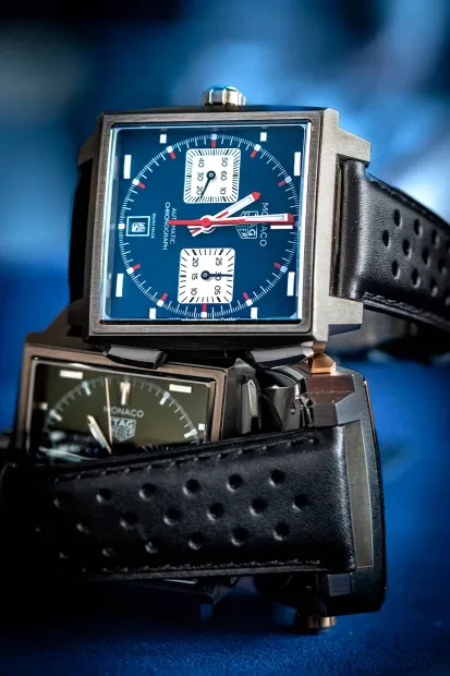
Most watches are designed to feel balanced, discreet, and universally appealing. The Monaco was never one of them. When it debuted in 1969, its square water-resistant case, blue dial, left-hand crown, and automatic Caliber 11 made it unlike anything else on the market. That originality wasn't immediately appreciated. The first Monaco proved to be a commercial failure and disappeared from the collection after only five years. Even Steve McQueen's decision to wear it in Le Mans in 1971 failed to change its fortunes. Only after its return in 1997 did the Monaco begin its second chapter, eventually becoming one of TAG Heuer's defining watches.

That history explains the changes introduced for 2026. The very features that once alienated buyers are the ones that have turned the Monaco into an icon. Its square case interrupts the natural line of the wrist. Its crisp edges catch the light. Its proportions demand attention. Updating a design like this inevitably raises a difficult question: how do you improve a watch built around such an uncompromising shape without softening its personality?
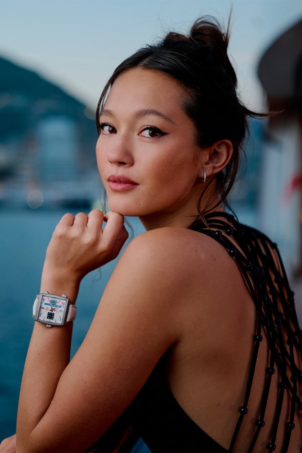
The answer becomes obvious once the watch is on the wrist—particularly on a woman's wrist. Few watches express their personality more clearly in that setting. The Monaco feels even bolder, its geometry more deliberate and its contrasts more striking. On a larger man's wrist, it naturally reads as a motorsport chronograph. On a woman's wrist, it takes on a different identity altogether: almost a piece of Brutalist jewelry.
The 2026 Monaco Chronograph and Evergraph both follow the same philosophy. TAG Heuer has reduced weight, softened the curves, refined the proportions, and improved ergonomics without changing the watch's unmistakable appearance. It still looks unconventional. It simply feels more natural to wear.
Preserving the shape
The Monaco Chronograph now comes in a 39mm Grade 5 titanium case featuring gently curved flanks and a redesigned caseback. The Evergraph takes the concept further with a 40mm case, slimmer side profiles, a square sapphire caseback, and elongated pushers. The sharp geometry remains intact. The crown still sits on the left. The watch retains the monolithic presence that has always defined it.
What TAG Heuer Changed
Weight
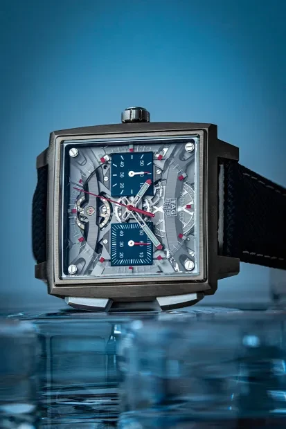
Titanium completely changes the wearing experience. The Monaco keeps all of its visual impact while shedding much of its physical heft. It still commands attention, but it becomes noticeably easier to wear throughout the day.

© TAG Heuer
Wrist Comfort
A curved caseback and redesigned case sides allow the watch to sit closer to the wrist. Earlier generations could sometimes feel as though they hovered above it. The new architecture follows the wrist's natural contours more closely, creating a more balanced and comfortable fit.
The Mechanics
The Evergraph completely rethinks the chronograph mechanism. Two bistable flexible components replace almost every traditional lever and spring responsible for the chronograph's start, stop and reset functions. Developed over five years, this entirely new architecture transforms not only how the movement works but also how the pushers feel. A watchmaking innovation this unconventional could hardly have found a more appropriate home than the Monaco.
What Could Never Change

The Square Case
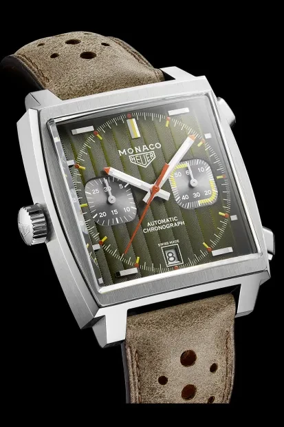
The square case interrupts the line of the wrist and reflects light unlike any round design. It remains the Monaco's defining signature—the feature that transformed an early commercial disappointment into a lasting icon.
The Asymmetry
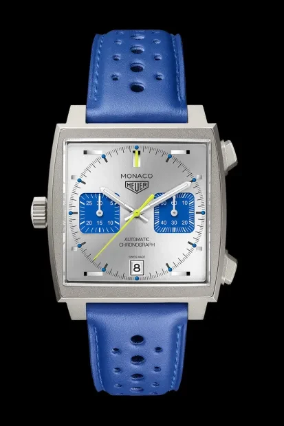
Originally dictated by the Caliber 11, the left-hand crown has become one of the Monaco's most recognizable details. It preserves the visual tension that defines the watch while creating a direct connection to the original Reference 1133 introduced in 1969.
The Sense of Excess
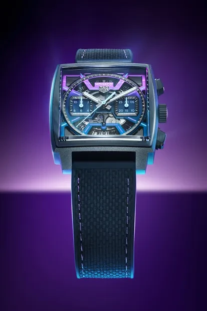
Bold colors, contrasting subdials, red hands, and an openworked architecture: the Monaco has always embraced visual intensity. Its appeal comes from that slightly exaggerated presence. Toning it down would take away far more than it would ever add.
Easier to Wear, Impossible to Mistake
The Monaco's story is a reminder that the market doesn't always recognize a great idea immediately. Once withdrawn after only five years, it ultimately became an icon because of the very qualities that initially limited its appeal. TAG Heuer now seems to understand exactly where the line should be drawn. The weight can change. The ergonomics can improve. The pushers can feel different. But the square case, the asymmetry and the bold personality remain untouchable. The 2026 Monaco is more comfortable than ever, yet it still delivers the visual tension that becomes especially striking on a woman's wrist. It has evolved without losing the defiant character that made it legendary.