Jordy Bellido
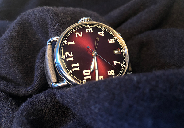
Watches with two time zones are definitely our thing at WorldTempus right now! This week, we tested the H. Moser Heritage Dual Time with its 42mm of comfort and pleasure in steel. Comfort, because it is a watch that fits perfectly on small wrists like mine, even though 42mm is more on the large side. Add to this a Kudu leather strap that hugs the wrist beautifully. Pleasure, because it is refreshing to see this smoky burgundy coloured dial that is certainly something different. Having worn it for a dial, I guarantee that it will not go unnoticed by those around you. With its minimalist design, this watch makes quite the impact!
On the practical side, the H. Moser & Cie Heritage Dual Time comes to life thanks to the new in-house self-winding calibre HMC 809. In addition to the date indication, this movement, which has a 72-hour power reserve, offers the dual time function (second time zone), indicated by a small grey hand. If you want to use it, select the time of your choice; and if you don’t want to use it, simply hide the hand under the white hand that indicates local time. It is that simple.
Jean-Christophe Teigner
Where should I start? This is the story of a very old Maison that rose from the ashes and became an “it” brand in a few short years. The proof? Yesterday evening, during a private party by another very beautiful manufacture, a guest spotted the watch from five metres away and came up to me to congratulate me on my choice of watch!
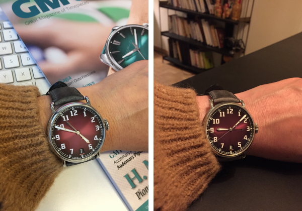
There is no denying that this is a beautiful timepiece with its dial in a very beautiful shade of reddish/purple, which is both intense and iridescent. The design of the watch is very pure and reinterprets the classic watchmaking codes to make it a retro-modern or modern-retro watch. And, on top of this, the brand name is almost invisible on the dial and yet there is no doubt about who made the watch, even from afar.
I was a little embarrassed to have to admit to my guest that the watch was a loan for a day and I would need to pass it on to my colleague the next day, like Cinderella, I was the prince of the ball of an evening!
Sophie Furley
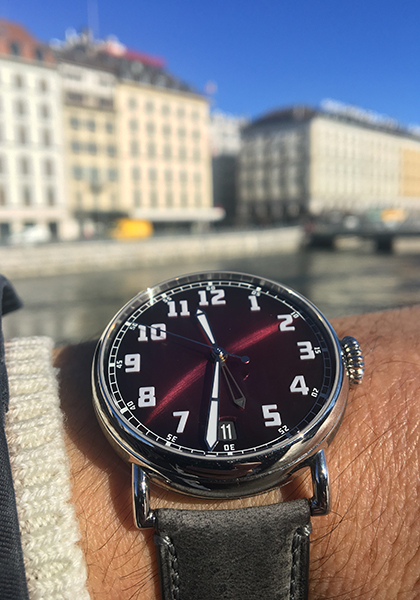
The H. Moser & Cie. could have been made for me. Firstly, because I love bold colours and this deep red smoked dial just makes me smile. And secondly, I can actually read the dial! I hate to admit this, even less write it down, but my eyes have been slowly failing me with age, making legibility a new and important factor in my choice of a watch today. What a pleasure to be able to look down at this dial with its large luminescent hands and numerals without my glasses and actually be able to read the time. I feel like a young woman all over again! I also love the feature where you can hide the second time zone hand behind the regular hands when not in use. It makes bringing it out a special treat when travelling, like when you get your suitcase down from the attic and start packing for a trip. After being stuck in Switzerland for so long, these little gestures that indicate the start of an adventure take on a whole new meaning.
Marie de Pimodan
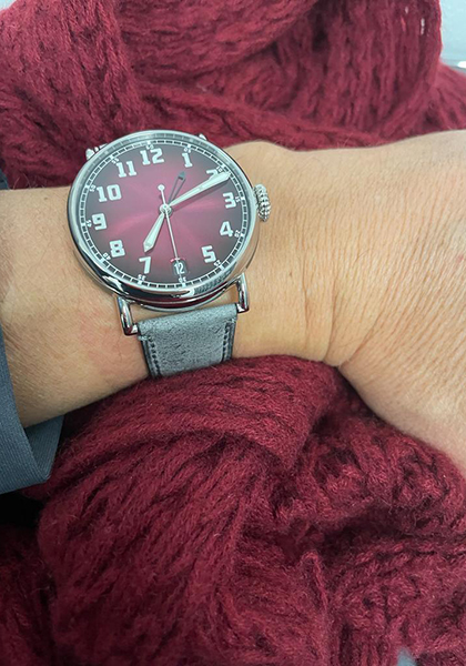
I am not a big fan of the colour red, except for a few touches here and there. I am more into shades of green or blue. It is probably due to affection for all things classic. But I have to admit that this time the burgundy hue of the Heritage Dual Time strapped to my wrist during this latest WorldTempus Team Test totally seduced me. I was warned by the technical/horological experts in the office that its elegance and comfort were equal to the proven reliability of its self-winding HMC 809 movement made in Schaffhausen at the H. Moser & Cie Manufacture, but it was its good looks that really caught my eye. Its 42mm steel case, its smoky dial that plays with the light with each movement of the wrist, its second time zone that stealthily accompanies me to other horizons and its calibre with exemplary finishing, have seriously impressed me. It was with a touch of the sadness that I had to return it, like a child who had to hand over her favourite toy!
Brice Lechevalier
With its roundness and burgundy colour, the Heritage Dual Time from H. Moser is as eye-catching from afar as a beautiful cherry on a cake at dessert time. It leaves no one indifferent and triggers both pleasure and astonishment. There is no visible brand name or logo on the dial (just a discreet M on the notched crown), and only watchmaking connoisseurs will recognize the generous luminescent white numerals shining brightly on the elegant smoked dial. H. Moser & Cie. Timepieces are normally quite sober in design, but the time indications here are quite bold, while the second time zone is discreet with an openworked hand. The visual harmony is completed by a stone-grey leather strap and pin buckle. It is joyful like the colours of spring between the lakes and the mountains.
Suzanne Wong
I’ve been a big fan of H. Moser & Cie. for a long time. First of all, the watchmaking itself is impeccable. Their technical legitimacy is rock-solid, thanks to their sister company Precision Engineering AG. They have their own proprietary hairspring alloy, and that alone should tell you how serious they are about all aspects of watchmaking. That said, my favourite part about this watch isn’t its movement. It’s not even the dial colour — even though people seem to assume that I automatically fall for any watch with a red dial. (Which is true to a certain extent, but not always.) It’s the invisible dial logo, applied in transparent lacquer, which can only be seen at certain angles, depending on the light. I love it — in my opinion it’s the perfect symbol of H. Moser & Cie. The transparent logo is subtle yet creative, a brilliant spark of branding. It’s hidden in plain sight; meaning it’s there, but you have to know where (and how) to look — just like H. Moser & Cie. watches. It rewards those who make the effort to go past superficial impressions and dig deeper — just like H. Moser & Cie. watches.