If you look at the history of black in watchmaking, there’s an obvious time lag. In comparison with other sectors, such as jewellery, clothing, furniture or cars, watches have remained some way behind. The main issue was a lack of appropriate materials. The first generations of black PVD cases were easily scratched, and the treatment proved generally unsuited to areas as exposed as watch cases and bezels. Then came ceramic and, at long last, more robust surface coatings such as DLC, and finally carbon fibre with its seemingly infinite variations. Since then, black has become more or less mainstream. It’s a colour like any other, offered in a wide variety of different applications. One of the most popular ideas currently involves exploiting colour contrasts.
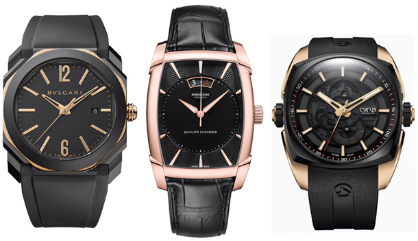
The idea is to combine the black of the dial or case, or even both, with subsidiary elements in gold. The dark colour dominates, emphasised by occasional accents of light. The Octo by Bulgari features an inner bezel, hour markers and hands in gold, along with the crown. The rest is PVD treated. Cyrus has chosen a gold case, which is virtually hidden beneath the highly visible black bezel. Alongside these sporty options, there are dressier watches where the lighter metal takes precedence. The case of the Parmigiani Kalpa Qualité Fleurier is made entirely of rose gold, but once again, it doesn’t dominate visually.
Ideally, the shade of gold should be vivid and arresting, which is why the favourite material for this register is yellow gold. But rose gold also works well, creating a softer contrast. The latest arrival in this register is bronze. It’s less expensive, more matt and very versatile, and makes a good replacement for the precious metal. Montblanc and Bell & Ross make the most of its more subtle lustre and sportier feel.

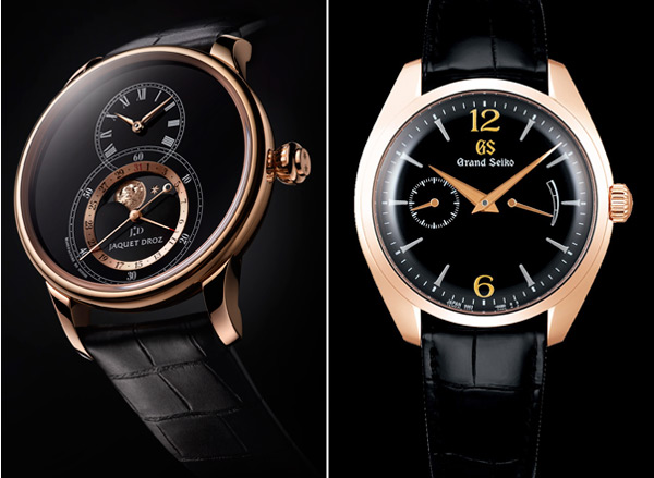
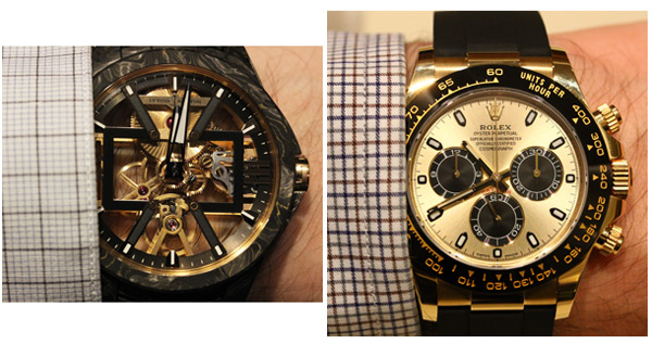
All these examples cover a broad spectrum of variations in the relative weight given to the dark and the light. The Skeleton X by Ulysse Nardin offers gold accents in the movement, picked up by delicate golden inclusions in the Carbonium case. The champagne dial of the Rolex Daytona is offset by black markers, and underpinned by an Oysterflex bracelet and Cerachrom bezel. And midway between the two, Jaquet Droz pairs a gold case with delicate outlining around the moon, while the Grand Seiko Elegance calls upon an Urushi lacquer dial to bring in the light.
In this play of light and shade, it’s all about proportion. More noble here, sportier there; more expensive, or more affordable; black and gold watches offer plenty of scope to dial it up or down – it’s up to you to choose your levels.