After a surprising Folle Journée unveiled at Watches & Wonders a few weeks ago, Trilobe is carrying on its journey, with the elegance, creativity and independence for which it is known, and extending its Nuit Fantastique collection with two new references.
Reimagining time
As an introduction to the brand, Nuit Fantastique is probably the best place to start. Understated, classy but not classic, impertinent and modern, it displays the time in an intuitive and unusual way.
Of the few who’ve succeeded in transforming time displays, many are independents. Think of Urwerk whose satellite display scrolls anti-clockwise or east to west, like the sun. Or Ressence with its revolving subdials and multiple off-centre hands, for fans of functional design. Then there’s MB&F, who for the past 15 years and more has been tracking hours and minutes on separate displays.
Trilobe’s Nuit Fantastique uses a concentric configuration, with hours around the periphery of the dial, then minutes, then seconds, thus drawing the eye from the outside towards the inside of the dial. There are no hands, and no central or centred elements. By leaving so much of the dial free, Trilobe has created a beautiful, clean aesthetic.
Grains of sand
Because the dial is the essence of Nuit Fantastique. It sets the tone in terms of colour but also style, as perfectly evidenced by these two new versions.
Variation number one features a “Dune” dial. The name corresponds first of all to the warm, sandy colour that shifts between beige and gold (Chanel’s beige gold comes to mind). Its coppery tones are softer, with a more earthy hue. It’s a colour that isn’t as commonplace as it may seem, and one that is richer, even more complex, than it might appear.
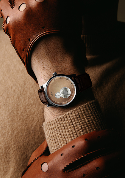
As well as evoking its colour, the “Dune” dial suggests the texture of sand. This Nuit Fantastique doesn’t have the smooth surface of water but instead takes on a lightly grained texture which delicately catches the light to then diffuse it in a canvas of shadow and light. Light isn’t reflected by the dial. It is absorbed by it, fuses with it.
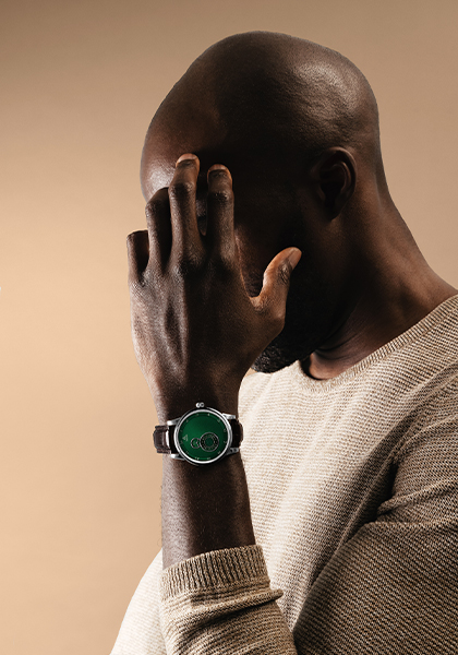
The power of green
The second variation will be more divisive… and more consensual. This is not the contradiction it appears to be: green is a bold colour that doesn’t go unnoticed but it’s also one of the most popular shades in watchmaking these past two years.
Trilobe’s green is confident, powerful and contrasted – especially when paired with a steel case and a brown leather strap. Perhaps younger than its “Dune” counterpart, with a more distinguished air, this green iteration will confirm the character of an experienced collector wishing to invest in the atypical nature of the brand as well as the colour.