
It would be premature to call it an icon or a cult watch, yet there is no denying the evidence: Trilobe’s new “Nuit Fantastique” demonstrates a level of maturity that marks a turning point in the development of this young French brand. With several colour choices already proposed, this latest execution brings confirmation that the model has truly come of age.
A new Nuit
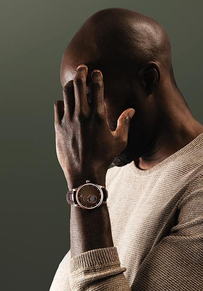
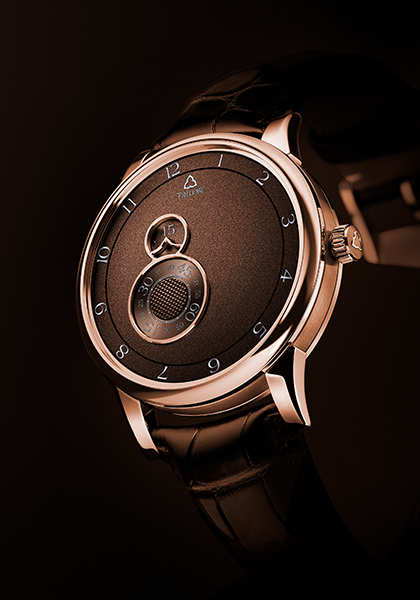
From a technical point of view, this particular “Nuit Fantastique” is no different from its stablemates. Aesthetically speaking, however, the combination of a pink gold case with a chocolate brown dial shows off the watch’s form and geometry in a completely new way. The design had already matured when Trilobe removed some of the indications and markers that were present on the early models in the “Les Matinaux” collection, namely three brand logos and three large concentric circles carrying scales for the hours, minutes and seconds. These made for a dial that was certainly identifiable but lacked breathing space.
The “Nuit Fantastique” collection uses the same underlying architecture but with a considerably simpler and cleaner dial presentation. Hours and seconds are again shown on rings whereas minutes are now indicated in an aperture. There are, of course, no hands, this being the signature of a Trilobe watch.
By “decluttering” the layout, retaining a single logo in a fixed position at 12 o’clock and without the concentric circles, Trilobe has opened up the dial with a composition that is airier and, at the same time, feels more intimate, more essential. The brand uses the reclaimed surface to propose an almost “métiers d’art” approach through a magnificently grained dial in a distinctive shade of chocolate brown that draws out the warmth of the pink gold case, previously seen paired with a charcoal grey dial.
Shape and spirit
Trilobe typically proposes its watches in two case sizes, in this instance 38.5mm and 40.5mm. The hardest part will be choosing between them. Both are gender-fluid and will have no difficulty in satisfying discerning collectors, who are often reluctant to go above 41mm.
Turning over the case reveals the latest iteration of the in-house X-Centric movement, whose foundations were laid by Jean-François Mojon. Trilobe has since modified the calibre, slimming it down from 13.5mm high to the current 8.8mm, and has joined forces with Le Cercle des Horlogers. The architecture allows a clear view of the balance wheel at 6 o’clock, certain gears and, at 12 o’clock, the micro-rotor with its attractive snailed decoration. Finishing — a lesson in sobriety — strikes exactly the right note and reflects the spirit of the dial, with nothing to add and nothing to take away.
Writing the future
So now what? The aesthetic direction seems clear, defined, inalterable almost as far as the dial presentation is concerned. Movement-wise a tourbillon comes to mind, even though this would mean a substantial increase in price; which Trilobe has always been careful to keep within reason.
Returning to the dial, the font for the seconds display could be refined: the 15, 30, 45 and 60 come across as slightly oversized compared with the other numerals. Also, it would be tempting to use all that empty space for a complication, perhaps a second time zone, or maybe a day or a date display. “I’ve got 15 years’ worth of ideas packed away,” says Gautier Massonneau, the brand’s founder, with a smile. Another option would be to develop different finishes. “We’re working on a guilloché decoration, but I’m also looking into mineral dials. Lapis-lazuli, labradorite or malachite, there are so many possibilities. See you at Watches and Wonders?” You bet!