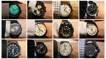
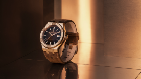
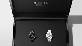
It’s a bit like a recipe. To create a successful vintage watch, designers have at their disposal a certain number of ingredients, which they prepare as they see fit. These details all come from different time periods and different registers, and they are all typical of a certain nostalgic style. Used all together at the same time, they make a heavy, indigestible meal. But in judicious, well-balanced proportions, precisely executed, they can be mouth-wateringly good. It’s a fine line between parody and elegance. The plethora of models available means that there are many of the former and fewer of the latter. To continue the metaphor, it’s become clear that 50% of restaurants (i.e. watch brands) serve up retro as a main course. Some are heavy-handed enough to line them up from starter to dessert.
So what are these ingredients, these compositional details so distinctive that they have become visual signatures? Here they are, in no particular order:
- brown Superluminova markers, reminiscent of aged radium or tritium, which can no longer be used.
- cursive or italic type with thick-and-thin strokes, like a neat copybook hand executed with a goose quill.
- a logo from the archives, often designating a collection of genuine re-issues or faux would-be revivals.
- sporty styling, ideally in a diver’s watch, or a tool watch designed for a time when one watch had to meet every need.
- steel, always satin-brushed, never polished, but with an obligatory variant in bronze or, for deluxe models, in (very yellow) yellow gold.
- rectangular applied markers, preferably with lume inlaid at the tips.
- a dial that’s lighter in the centre and darker at the edges, to mimic “tropical” dials that have suffered from too much sunlight (and which are genuinely aged).
- a few gold accents amid lots of steel, such as the crown, bezel and markers, a nod to those watches that were designed to be affordable but with a few eye-catching touches of luxury.
- a two-tone gold and steel case – a progression of the above-mentioned trend that had its heyday in the 1980s.
- monobloc cases with integral lugs that don’t extend beyond the edge of the case.
- minimalist styling, with slim hands and markers to denote the 1940s and 50s.
- small cases – not as small as they would have been originally, when 33 to 36 mm was standard – but it’s considered good taste to stay within the 36 to 40 mm size.
- a leather strap, which may be aged, patinated, cracked, distressed or perforated, but always with obligatory contrasting topstitching along each side, starting just before the lugs. Any colour is fine, as long as it’s brown.
- a fabric strap, nylon or perlon, woven or braided, some kind of NATO strap, in short, preferably in an unusual colour combination.
- for the 1980s a rather ugly typeface is needed, something a little too spindly, which has aged badly (it has to be said that the 80s represent something of a nadir in watch design...)
- a touch of orange or electric blue, doesn’t matter where – hands, counters, dial motif, topstitching.
- a plexiglas crystal if at all possible; if not, mineral glass and, if sapphire absolutely cannot be avoided, it must be domed, “chevé”, top-hat or glass-box style, to make it stick out a bit.
- perfectly rectangular baton hands for the 1970s, dauphine or very slim leaf-shaped hands for the 60s, and cathedral style for the 1910s, 20s and 30s.
- collections and models may be named Heritage or Tradition, along with a date.
- a nickname or diminutive, to give the illusion that the watch is well-known in vintage circles and thus has assured legitimacy.


