How do we recognise a brand? By its watches? By its CEO? By its slogan? By its logo? None of these, in fact – for the simple reason that they are constantly changing. But one item on that list does tend to stick around, and that’s the logo, the central element of a brand’s visual identity, sometimes even of the brand itself.
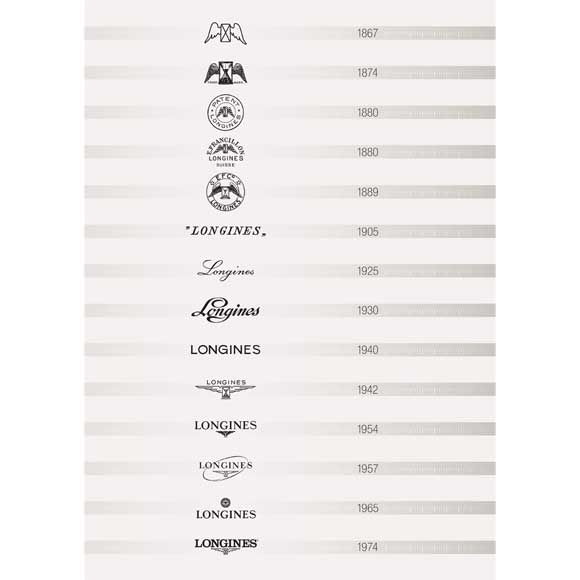
Longines, the exception
Nevertheless, logos remain poorly understood by the public, on the whole. We recognise them, but we don’t really know them. Which is rather unfortunate, because in just a few strokes of the pen, it needs to convey the brand’s positioning, even its history. Take Longines. It holds all the records: its winged hourglass has been around for 127 years!
It is the world’s oldest trademark still in use today that remains unmodified in the records of WIPO, the World Intellectual Property Organisation. It has become a “symbol of consistency, perseverance and savoir-faire,” according to company CEO Walter von Känel. Originally, however, its purpose was far more mundane: the practice of engraving an hour glass on a movement was a measure to deter counterfeiters.
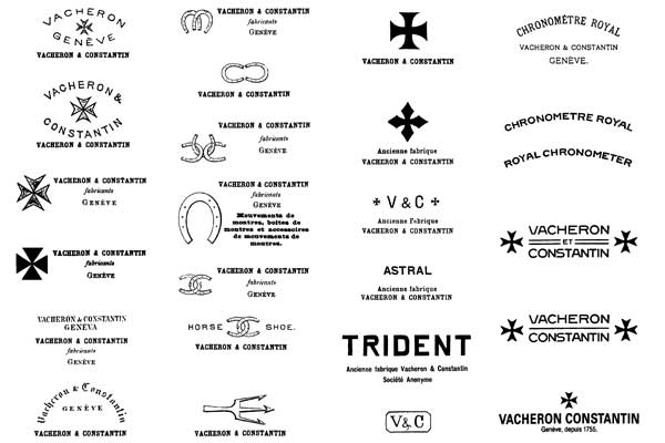
Mysterious Vacheron Constantin
Longines is notable for its remarkable consistency, but this is far from being a universal trait in the watch industry. Many people believe that the Maltese Cross has always been Vacheron Constantin’s emblem. They couldn’t be more wrong! Since 1755 the company has changed its logo around 50 times, and in most of these emblems the Maltese Cross has not figured at all.
For many years Vacheron Constantin used the logo of its American division, which was named Horse Shoe, hence the plethora of... horseshoes. Another little-known fact is that for a long time the manufacture owned a secondary brand called Trident, whose symbol was also often used.
Discreet additions by the Swatch Group
But there’s nothing wrong with wanting to change your logo, after all. Some do so cautiously, others throw caution to the winds. Breguet, for example, has made just one change during its history. When the company joined the Swatch Group, the master’s signature was augmented with two small hands, the famous “hollow apple” or Breguet hands.
Here’s another piece of trivia: when Jaquet Droz joined Swatch in 2000 the company acquired a discreet “JD” monogram with two stars. Why? To symbolise the founding father and son. Chronoswiss has a similar story. To those who wonder about the apparently random “RL” in the centre of its logo, these are the initials of Gerd-Rüdiger Lang, the company’s founder.
Tinkering with the typography
Girard-Perregaux has kept up with the times. Its typography has evolved from decade to decade, accompanied by a range of different slogans. Recently, the company has gone back to “Haute horlogerie suisse depuis 1791”, which astute observers might recognise from the “Fine watches since 1791” of a previous era, mixed in with “Mechanics of time since 1791”, which followed the outmoded “Les chronométriers”. This editorial tinkering is unmatched in the watch industry.

For decades now, marketing gurus have understood that changing a logo (too) often affects a brand’s readability, particularly in situations of fierce competition such as the industry is experiencing today.
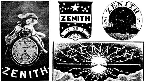
Zenith, which for many years alluded to its astronomical name with a variety of more or less lyrical designs, settled on its single five-pointed star a few decades back and hasn’t budged since. This discreet symbol of historical continuity can also be found at Eterna, whose five balls hark back to the company’s invention of the ball-bearing-mounted rotor.